Sitting Room

Sitting Room
Showing posts with label interior design. Show all posts

Wednesday, May 5, 2010

Second Petal of Design: Light

Ten years ago I traveled to Haiti. The day began in the airport in Norfolk, Virginia around 4:00 a.m. By 5:00 p.m. I landed in Port-au-Prince. By 6:00 I had my bags and was making my way through customs. By 7:00 I boarded a bus as the sun began to set and slowly began to make my way to the other side of the island to Les Cayes. By 8:00 I found myself in complete darkness. I traveled through towns and villages of thousands and did not realize it. A trip that distance-wise should have taken several hours took 7 due to the limited visibility and road conditions. The absence of light began to unnerve me. I never realized how addicted to light I was. Upon my arrival in Les Cayes, I was met with more darkness. I was not prepared for the despair caused by the lack of light. Even Motel 6 leaves the light on for you! I had traveled for close to 24 hours and there was no beacon to welcome me. My 2 weeks spent in Haiti were filled with wonderful people, unrivaled experiences, beautiful scenery, wonderful food, more than generous hospitality (which was rather humbling), mosquitoes, 100% deet, and very dark nights.

I share this story because my experience in Haiti forever changed my perspective on light.

Ecclesiastes 11:7 says, "Light is sweet, and it is pleasant for the eyes to see the sun."

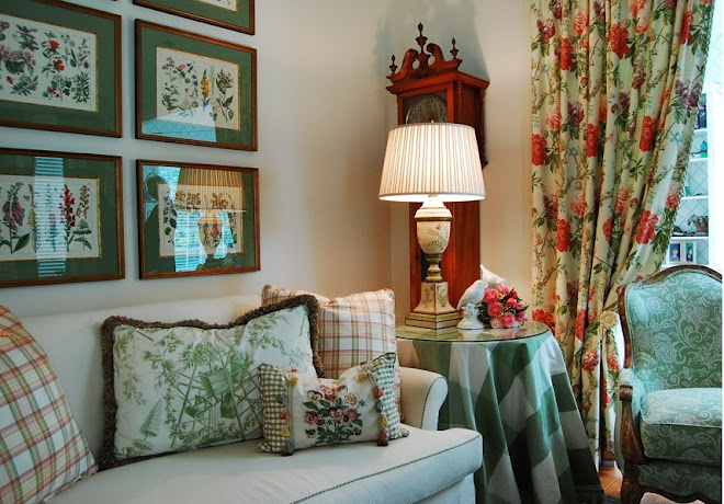
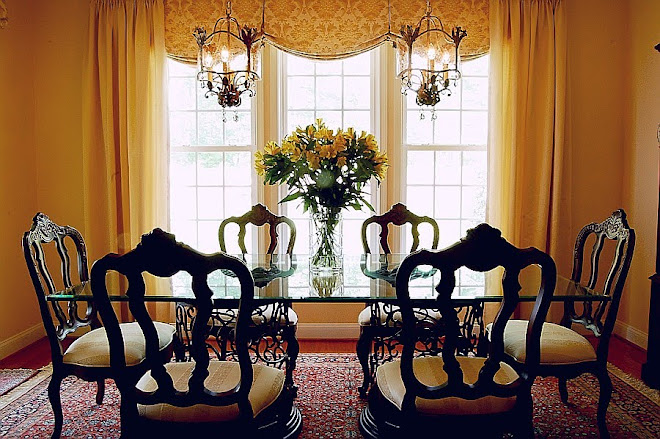
Light is sweet. Our bodies embrace it. Bringing light into a room is so much more than making sure a lamp is next to your favorite chair for the purpose of reading. Light not only illuminates (i.e. reveals color) in a room, it sets the mood. When designing a room for light, I tend to be a purist. Haiti gave me such an appreciation for natural light. Thomas Jefferson (who architecturally I hold as quite brilliant), at Monticello, maximizes the function of natural light by strategically orienting rooms and windows based on activities to take place in each given room. Now you may not be able to re-orient your space but I do believe that you can add or maximize the natural light the room receives and only add artificial light as a continuation where the natural light ends.

Natural lighting techniques would include: windows; skylights; glass partition walls; doors; fire (I think a real one is always best) and candles.

Artificial light would include: chandeliers; lamps; spots (especially on fabulous art or something else you love that you would want to dramatically highlight to make a statement); recess lights and sconces.
With artificial light it is necessary to use dimmers whenever possible so that the mood of the room can be easily adjusted for different tasks.

And finally, as Haiti taught me, don't forget that light is also a beacon. Design and use your outside lighting (every time) to welcome friends and family into the beautiful home you are creating. As always, I am here to assist you with any design needs you may have.

Elizabeth Kennis, LEED AP
Designer


Friday, April 9, 2010

First Petal of Design: Color

What is it about color that attracts or repels us?
It has been said "the eye is the light of the body." Just like Pavlov's dog, our brain is going to trigger physical responses to certain sensory intputs. In this case, the spectrum of colors can and does illicit an output of sensory responses ranging from joy to sadness; I call this color instinct.

The following research details our emotional connection to the colors of the spectrum. Remember ROY G BIV from elementary school science? You always knew it would be useful. (Just wait, next month I will tie in graphing linear equations to kitchen re-designs..ha ha).

The Prism of Light and Emotion
Red: Energy, passion and drive
Orange: Elicits compassion and facilitates conversation
Yellow: Clarifies thought and raises optimism
Green: Feelings of love, well-being and encourages hospitality
Blue/Indigo: Encourages confidence and promotes serenity
Violet: Feelings of introspection and resolve
Black: Small amounts add drama and contrast but too much can bring sadness or despair
White: Illuminates a space an makes it seem cleaner and larger while providing contrast
Gray: Increases productivity *

What emotions do you want to feel when you enter your room? Now you have a guideline to use in the color spectrum to guide your color choice. The intensity of the color will produce the same intensity of emotion. Invigorating colors such as reds and oranges work well in family rooms and dining rooms because they stimulate emotion and conversation. Blue is a color that works well in a bedroom, library or office because it is calming and confident. I love green in high traffic areas like family rooms and kitchens especially with neutrals and whites not only because those rooms are where we spend most of our time as families and what better place to encourage nurturing and growth, but also because it connects us with the outdoors. Don't forget the value of taupes and grays as a neutral pallate on which you can paint your desired emotional response.

Once we consider these "colors of emotion" we have to employ them with the right technique.
  • How light or dark do you want the room to be?
  • If the color is paint for the walls, it is always a good idea to paint a small area first and see how the color works with the amount of light in the room.
  • Don't forget that light is a necessary element in color. You must consider the amount of natural and artificial light a room will receive when selecting colors because color will change based on lighting.
  • Contrast between color applications in the room adds drama and contrast is a good thing! Don't be afraid to make stark contrast!
  • Complimentary use of color applications provides the foundation of your room. Most elements in the room should compliment one another with minimal contrast.
  • Balance the color use within a room. Color applications create lines for the eye to rest on. Do your lines balance out? Is there centrality? You can create this by having a central focal point such as a sofa, coffee table, fireplace, etc. flanked by equal objects.
  • Balance the use of color throughout the whole interior space. Does your house feel like Romper Room as you move from room to room or does each room work with and compliment the adjoining rooms? Your home will feel much larger if you will allow rooms to work together instead of making each an independent space (especially with regards to wall color). If you don't want every room the same color, try using different strengths of the same color. Full strength works well in rooms with more light. Foundational colors don't have to match but they do need to be similar.

Now that we have thought about color, how do we use it to contrast, compliment and balance our interior space?

We give it application in the form of walls & trim paint (use a low or no voc paint if you can because they don't contain volatile chemicals and will not smell while wet), fabrics (upholstered furniture, pillows and window treatments), accessories (art is one of my favorites and it should make a statement!), rugs and flooring.

For example, you may want your walls, window treatments, upholstered furniture and flooring to compliment one another while providing contrast with a fabulous large oil painting centrally located. Small bits of contrast color could be added in the form of pillows (or even just pillow trim), fresh flowers (a large glass container bulging with lilting tulips is my favorite), candles or decorative items (such as an antique platter).

Have fun with color and always keep in mind that less is more! Keep contrast simple and use complimentary colors in adjoining spaces. By doing this, you will set the groundwork for a timeless and elegant home you will love to come home to!

If you get stuck, I am happy to help you in the design process!

We will cover our next petal of design: LIGHT on May 7th.

Eizabeth Kennis, LEED AP

*Marberry, Sara O.. "The Power of Color." New York: John Wiley & Sons, Inc.: 1995.

Friday, March 12, 2010

genius loci: the distinctive atmosphere or pervading spirit of a place (compliments of answers.com)

Have you ever looked at your home or place of business and thought to yourself, "This just doesn't evoke the feeling I want it to evoke."?

Every defined space needs to speak to you. How do you want to feel when you enter that space?

Don't get frustrated if you are feeling overwhelmed! The space that first came to your mind has qualities which can be developed! Just like petals come together to form a flower, there are many "petals" in design that must come together to create the desired bloom. My goal is to help you think through each petal as you create the perfect space!

No matter what your style, the petals of design remain the same.
  • color
  • light
  • texture
  • lines
  • scale
  • balance

Over the course of the next 6 months (I am blogging once a month), I will expand in detail on each element of design.

My challenge to you is to begin to see the spaces around you in a new way, and to help you manipulate them to create an environment that you (and others) look forward to being a part of.

My next blog will be Friday, April 9

Elizabeth Kennis, LEED AP and Designer