
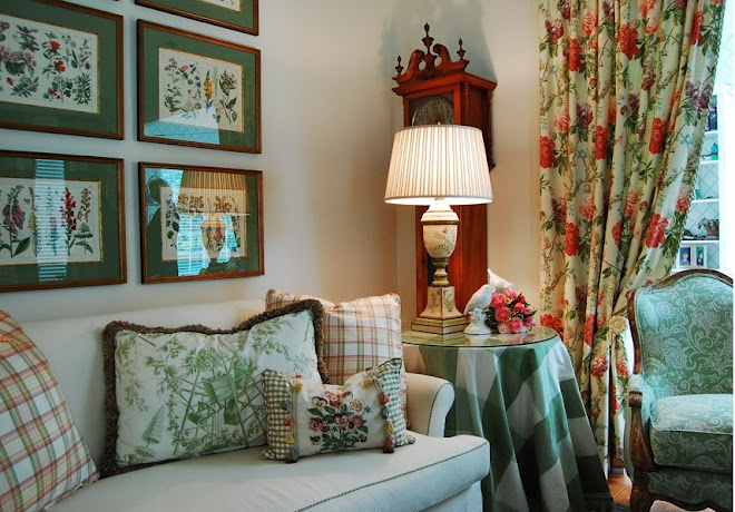
Hi Everyone! Last month, I discussed how custom pillows are one way to create a new look on a budget. This week my tip is going to deal with mirrors.
Mirrors can do a variety of things which are beneficial to the space. One thing mirrors can do is make the room appear larger than it really is. I hear many people say they wish they had a bigger space but do not have the means to actually make the room larger. By placing mirrors across from a light source (such as a window), it will reflect light and make the room look brighter. Brighter rooms will trick the eye into thinking the space is bigger than it actually is.
Another thing mirrors can do is add interest to a room. You can achieve adding this interest, by using different sizes and shapes to create a unique pattern. You can turn a boring room into something really exciting. The boring blank wall in your house or apartment could potentially be the focal point in your space.
Lastly, in recent times mirrored furniture is becoming extremely popular. I recently purchased a mirrored nightstand and I love it! Mirrored furniture can create the same effects that mirrors on walls can do.
Just like pillows can do something great for your space on a budget, so can mirrors! You can purchase some really great mirrors at a great price. Come into the shop and check out some of our lines that carry some fabulous mirrors!!
I will be blogging again in four weeks! Come back and check it out:)
Friday, April 23, 2010
Friday, April 16, 2010
Designing your home around the things you love...
The first rule of design, I believe, is that there are no rules...just guidlines. And if you are in persuit of your own personal style, begin by doing some window shopping. Start by looking through designer and home decorating magazines, clipping out the pages that you love. Then create your own design portfolio. Going through this portfolio will quickly reveal to you what type of rooms continually catch your eye. In one of my favorite design books there is a quote "Look first, read second, and buy third". With so many things out there, so many trends, fads and influences, the idea of "trying things on" without making a commitment is very wise.
What I mean by trying things on is to envision things in your space. For instance, will these colors suit your surroundings? Imagine yourself in the room that you want to create. Will it be comfortable for your family? Will it function the way you will like it to? Will these trends quickly pass, will I tire of them easily? And is that okay?
Too many people get caught up in searching for style and end up copying someone else's look. It is much more important to fill your home with the things you love, to create a place for your family and friends to feel comfort, peace and joy.
I will blog again on May 14th and continue this journey with you. Let me know how you are doing with your own portfolio.
Danelle Shirkman Owner/Designer
Friday, April 9, 2010
First Petal of Design: Color
What is it about color that attracts or repels us?
It has been said "the eye is the light of the body." Just like Pavlov's dog, our brain is going to trigger physical responses to certain sensory intputs. In this case, the spectrum of colors can and does illicit an output of sensory responses ranging from joy to sadness; I call this color instinct.
The following research details our emotional connection to the colors of the spectrum. Remember ROY G BIV from elementary school science? You always knew it would be useful. (Just wait, next month I will tie in graphing linear equations to kitchen re-designs..ha ha).
The Prism of Light and Emotion
Red: Energy, passion and drive
Orange: Elicits compassion and facilitates conversation
Yellow: Clarifies thought and raises optimism
Green: Feelings of love, well-being and encourages hospitality
Blue/Indigo: Encourages confidence and promotes serenity
Violet: Feelings of introspection and resolve
Black: Small amounts add drama and contrast but too much can bring sadness or despair
White: Illuminates a space an makes it seem cleaner and larger while providing contrast
Gray: Increases productivity *
What emotions do you want to feel when you enter your room? Now you have a guideline to use in the color spectrum to guide your color choice. The intensity of the color will produce the same intensity of emotion. Invigorating colors such as reds and oranges work well in family rooms and dining rooms because they stimulate emotion and conversation. Blue is a color that works well in a bedroom, library or office because it is calming and confident. I love green in high traffic areas like family rooms and kitchens especially with neutrals and whites not only because those rooms are where we spend most of our time as families and what better place to encourage nurturing and growth, but also because it connects us with the outdoors. Don't forget the value of taupes and grays as a neutral pallate on which you can paint your desired emotional response.
Once we consider these "colors of emotion" we have to employ them with the right technique.
- How light or dark do you want the room to be?
- If the color is paint for the walls, it is always a good idea to paint a small area first and see how the color works with the amount of light in the room.
- Don't forget that light is a necessary element in color. You must consider the amount of natural and artificial light a room will receive when selecting colors because color will change based on lighting.
- Contrast between color applications in the room adds drama and contrast is a good thing! Don't be afraid to make stark contrast!
- Complimentary use of color applications provides the foundation of your room. Most elements in the room should compliment one another with minimal contrast.
- Balance the color use within a room. Color applications create lines for the eye to rest on. Do your lines balance out? Is there centrality? You can create this by having a central focal point such as a sofa, coffee table, fireplace, etc. flanked by equal objects.
- Balance the use of color throughout the whole interior space. Does your house feel like Romper Room as you move from room to room or does each room work with and compliment the adjoining rooms? Your home will feel much larger if you will allow rooms to work together instead of making each an independent space (especially with regards to wall color). If you don't want every room the same color, try using different strengths of the same color. Full strength works well in rooms with more light. Foundational colors don't have to match but they do need to be similar.
Now that we have thought about color, how do we use it to contrast, compliment and balance our interior space?
We give it application in the form of walls & trim paint (use a low or no voc paint if you can because they don't contain volatile chemicals and will not smell while wet), fabrics (upholstered furniture, pillows and window treatments), accessories (art is one of my favorites and it should make a statement!), rugs and flooring.
For example, you may want your walls, window treatments, upholstered furniture and flooring to compliment one another while providing contrast with a fabulous large oil painting centrally located. Small bits of contrast color could be added in the form of pillows (or even just pillow trim), fresh flowers (a large glass container bulging with lilting tulips is my favorite), candles or decorative items (such as an antique platter).
Have fun with color and always keep in mind that less is more! Keep contrast simple and use complimentary colors in adjoining spaces. By doing this, you will set the groundwork for a timeless and elegant home you will love to come home to!
If you get stuck, I am happy to help you in the design process!
We will cover our next petal of design: LIGHT on May 7th.
Eizabeth Kennis, LEED AP
*Marberry, Sara O.. "The Power of Color." New York: John Wiley & Sons, Inc.: 1995.
Friday, April 2, 2010
Welcome Spring! Along with welcoming the sunny days, the beautiful spring flowers and our lighter wardrobes...our minds always turn to our homes at this time of year. Spring cleaning…yes, I said it...cleaning… time to throw open those windows, dust off the sills, and let the sunshine in! It’s also that time of year for those DIY (do-it-yourself) projects to start. When everything is fresh and new outdoors, we want our interiors to reflect that same fresh, new feeling. As an interior designer, my own home is always changing...literally “with the seasons”. We have our crisp summer slipcovers with their cool, casual style; we transition into our warm and cozy holiday decorating; next to our fresh, clean winter look; and now that spring has arrived we are all ready for those bright and sunny colors to awaken us from our winter doldrums. Whether your Spring Fever leads you to full scale remodeling, or just to some redecorating, an interior designer can give great advice, such as a fresh and thoughtful furniture arrangement or ways to edit your collections to make them seem bright and new. Consider small fixes, such as fresh paint in your entryway or introducing a fun, new fabric to your design scheme. And definitely bring the outdoors in with some fresh hydrangea, daffodils, forsythia, or even some newly budding branches from your own backyard. There are so many ways to welcome spring into our homes, just remember to take time to enjoy the warm days to liven up your spirit as well as your interiors! Enjoy!
I promised each month to introduce a term or subject, define it and tell about its use in design. This month we'll explore "fleur de lis", pronounced "flur da lee". The fleur-de-lis is a stylized lily (in French, fleur means flower, and lis means lily) or iris that is used as a decorative design or symbol.While the fleur-de-lis has appeared on countless European coats of arms and flags over the centuries, it is particularly associated with the French monarchy in a historical context, and continues to appear in the arms of the King of Spain and the Grand Duke of Luxembourg, members of the House of Bourbon. It remains an enduring symbol of France that appears on French postage stamps, although it has never been adopted officially by any of the French republics. In North America, the fleur-de-lis is often associated with areas formerly settled by France, such as Quebec, St. Louis, Louisville, and Louisiana. The photos below show a
Fleur-de-lis on a 14th century Syrian albarello (a ceramic pharmacy or drug jar, generally majolica ware) and a drawing of an Iris compared with a fleur-de-lis ornament from a French Dictionary of Architecture, reflecting a clear picture of the origin of the symbol. And now you know...
Subscribe to:
Posts (Atom)


