
Monday, May 31, 2010
Defining Design for Generations
I recently had the opportunity to read a portion of The Home Within Us, architect Bobby McAlpine's second book. "McAlpine speaks poignantly from his head and heart about everyone’s personal search for home. Armed with the perspective of a southerner and an arsenal of architectural experience, he reveals his thoughts on grace, the human condition, tenderness of place and what we know to be true in our lives," As I read his words, I thought about how important home is. He speaks of the home within us, and continually reaching into this home within to help us create our physical homes. I have a son recently graduated from college who will soon be venturing out to create his own home...a new generation. I wonder what he will take with him from our home, what he will consider when designing, furnishing and creating his own home. What will be his "personal search for home"? Has our home he has occupied for 22 years affected his "home within?" My generation, and my mother's before me, considered so much when furnishing and designing our homes. My mother always considered us, her family, first. Our comfort, our tastes, and our "entertaining styles" even as kids. Of course there were "grown up spaces" (I'll never forget my mother coming into the LIVING ROOM -definitely a grown up space- to find my 5 or 6 year old self and my two girlfriends propped up on the sofa eating our popsicles!! I was "entertaining"! Of course we were promptly escorted to a more popsicle appropriate space). I, in turn, designed and decorated my home for my family. Kid friendly for years, now a little more sophisticated as they have grown. I have pieces from my mother, my grandmother, and my mother-in-law and I infuse these with the new things we continue to collect and acquire. My home within is comfortable...it is not trendy or pretentious. It is full of beauty, as it is my love of home and my chosen career to create beautiful, yet livable, interiors. But it seems, with this new generation, my children's generation, that things are changing. This instant era, created with the onslaught of fast food, immediate information via the internet, and disposable everything intrigues me. With everything changing so instantly, will they value "grace, the human condition, and tenderness of place" that Mr. McAlpine speaks so eloquently about? Will my son take with him any of his family treasures, or will he create the instant home from catalogs and box stores? Will home be a haven, a place true to his life, a comfort and shelter from the outside world? My hope is that it will be...that he, and others of his generation will continue to create homes that reflect their personalities, their needs, and that they will care about these things as they relate to home. Times change, styles change, needs change, generations change, but the need of the shelter of home stays the same. To me it is a need for family, a place to be myself, to be comfortable, sometimes to cocoon myself and my family from the outside world, and at other times to welcome friends and strangers alike, sharing a little of what my home means to me with others. I know to some it is to share beauty, design, and the landscape of their lives. To others it is simply a place to rest and re-energize in order to face the world refreshed each day. For those of us who plan, design, arrange, and understand the affect home has on our daily lives, we continue to hope that each generation that follows us will continue to plan, design and arrange...to utilize architects, designers and their own "home within", to respect the generations before and embrace the generations to come, to love tradition while welcoming change, and not to fall into the "easy" or the "instant" or the "fast". Take the time to explore your home within. Consult with an architect or an interior designer, they can imagine right along with you and turn your wants, needs and dreams of your "home within" into a physical reality to share and enjoy for years to come.
Friday, May 21, 2010
Chic and Timeless
Hi Everyone -
Last month I discussed using mirror as something you can do at low cost that really makes a difference in a space. This week I want to discuss the value of wallpaper.
Wallpaper has come a long way from the old styles of flowers and bows. Now, the styles are chic and timeless. Wallpaper can do so much for a room. It can add color, pattern and texture.
Yes, some old paper can be pricey, but you don't need to go wallpaper crazy. Select one or two rooms that you would want to impact you and your guests and focus on those rooms.
If done correctly, you can wallpaper on a budget. Come into the store and I can select one that would fit your tastes. Check out a few of my favorites below.
A chic new look
Hi Everyone!
Last month I discussed using mirrors as something you can do at low cost that really can make a difference in a space. This week I want to discuss the value of wallpaper.
Wallpaper has come a long way from the old styles of flowers and bows. Now, the styles are chic and timeless. Wallpaper can do so much for a space. It can add color, pattern, and texture.
Yes, some wallpaper can be pricey, but you do not need to go wallpaper crazy. Select one or two rooms in your home that you would like to have an impact on you and your guests. I personally would select a dining room. It is a room I would focus more on because I value a good meal and sharing it with family and friends and so I would dress it up a bit.
If done correctly, wallpapering a room can be done at a reasonable price and would have a great impact on a room. Come in and check out our great lines and I can select one that will fit your taste! Check out some of my favs below!
Thursday, May 13, 2010
Designing your home around the things you love part III
We all enjoy being surrounded by beautiful things, displaying our favorite keepsakes and that feeling of comfort that being "home" creates. We also want our guests to feel this warmth and welcoming comfort, to know that they can curl up on the sofa or get cozy in any chair. To us, that is the true meaning of style. Designers will be the first to say that it is much more difficult to start a design project from scratch. Our best work is a combination of finding what you love and using what we know to create your perfect room. A treasured piece of art, a piece of furniture or a rug are more obvious starting points when beginning a decorating project. But don't overlook your fabulous collection of glassware or china, or even a sample of fabric or wallcovering. The important thing here is identifying what it is about this project or collection that pleases you. Is it the color? The shape? Or is it the era or style that it reflects? Once identified you can begin to build on those characteristics in your interiors.
Wednesday, May 5, 2010
Second Petal of Design: Light
Ten years ago I traveled to Haiti. The day began in the airport in Norfolk, Virginia around 4:00 a.m. By 5:00 p.m. I landed in Port-au-Prince. By 6:00 I had my bags and was making my way through customs. By 7:00 I boarded a bus as the sun began to set and slowly began to make my way to the other side of the island to Les Cayes. By 8:00 I found myself in complete darkness. I traveled through towns and villages of thousands and did not realize it. A trip that distance-wise should have taken several hours took 7 due to the limited visibility and road conditions. The absence of light began to unnerve me. I never realized how addicted to light I was. Upon my arrival in Les Cayes, I was met with more darkness. I was not prepared for the despair caused by the lack of light. Even Motel 6 leaves the light on for you! I had traveled for close to 24 hours and there was no beacon to welcome me. My 2 weeks spent in Haiti were filled with wonderful people, unrivaled experiences, beautiful scenery, wonderful food, more than generous hospitality (which was rather humbling), mosquitoes, 100% deet, and very dark nights.
I share this story because my experience in Haiti forever changed my perspective on light.
Ecclesiastes 11:7 says, "Light is sweet, and it is pleasant for the eyes to see the sun."
Light is sweet. Our bodies embrace it. Bringing light into a room is so much more than making sure a lamp is next to your favorite chair for the purpose of reading. Light not only illuminates (i.e. reveals color) in a room, it sets the mood. When designing a room for light, I tend to be a purist. Haiti gave me such an appreciation for natural light. Thomas Jefferson (who architecturally I hold as quite brilliant), at Monticello, maximizes the function of natural light by strategically orienting rooms and windows based on activities to take place in each given room. Now you may not be able to re-orient your space but I do believe that you can add or maximize the natural light the room receives and only add artificial light as a continuation where the natural light ends.
Natural lighting techniques would include: windows; skylights; glass partition walls; doors; fire (I think a real one is always best) and candles.
Artificial light would include: chandeliers; lamps; spots (especially on fabulous art or something else you love that you would want to dramatically highlight to make a statement); recess lights and sconces.
With artificial light it is necessary to use dimmers whenever possible so that the mood of the room can be easily adjusted for different tasks.
And finally, as Haiti taught me, don't forget that light is also a beacon. Design and use your outside lighting (every time) to welcome friends and family into the beautiful home you are creating. As always, I am here to assist you with any design needs you may have.
Elizabeth Kennis, LEED AP
Designer
Friday, April 23, 2010
Style on a Budget: Mirrors
Hi Everyone! Last month, I discussed how custom pillows are one way to create a new look on a budget. This week my tip is going to deal with mirrors.
Mirrors can do a variety of things which are beneficial to the space. One thing mirrors can do is make the room appear larger than it really is. I hear many people say they wish they had a bigger space but do not have the means to actually make the room larger. By placing mirrors across from a light source (such as a window), it will reflect light and make the room look brighter. Brighter rooms will trick the eye into thinking the space is bigger than it actually is.
Another thing mirrors can do is add interest to a room. You can achieve adding this interest, by using different sizes and shapes to create a unique pattern. You can turn a boring room into something really exciting. The boring blank wall in your house or apartment could potentially be the focal point in your space.
Lastly, in recent times mirrored furniture is becoming extremely popular. I recently purchased a mirrored nightstand and I love it! Mirrored furniture can create the same effects that mirrors on walls can do.
Just like pillows can do something great for your space on a budget, so can mirrors! You can purchase some really great mirrors at a great price. Come into the shop and check out some of our lines that carry some fabulous mirrors!!
I will be blogging again in four weeks! Come back and check it out:)
Friday, April 16, 2010
Designing your home around the things you love...
The first rule of design, I believe, is that there are no rules...just guidlines. And if you are in persuit of your own personal style, begin by doing some window shopping. Start by looking through designer and home decorating magazines, clipping out the pages that you love. Then create your own design portfolio. Going through this portfolio will quickly reveal to you what type of rooms continually catch your eye. In one of my favorite design books there is a quote "Look first, read second, and buy third". With so many things out there, so many trends, fads and influences, the idea of "trying things on" without making a commitment is very wise.
What I mean by trying things on is to envision things in your space. For instance, will these colors suit your surroundings? Imagine yourself in the room that you want to create. Will it be comfortable for your family? Will it function the way you will like it to? Will these trends quickly pass, will I tire of them easily? And is that okay?
Too many people get caught up in searching for style and end up copying someone else's look. It is much more important to fill your home with the things you love, to create a place for your family and friends to feel comfort, peace and joy.
I will blog again on May 14th and continue this journey with you. Let me know how you are doing with your own portfolio.
Danelle Shirkman Owner/Designer
Friday, April 9, 2010
First Petal of Design: Color
What is it about color that attracts or repels us?
It has been said "the eye is the light of the body." Just like Pavlov's dog, our brain is going to trigger physical responses to certain sensory intputs. In this case, the spectrum of colors can and does illicit an output of sensory responses ranging from joy to sadness; I call this color instinct.
The following research details our emotional connection to the colors of the spectrum. Remember ROY G BIV from elementary school science? You always knew it would be useful. (Just wait, next month I will tie in graphing linear equations to kitchen re-designs..ha ha).
The Prism of Light and Emotion
Red: Energy, passion and drive
Orange: Elicits compassion and facilitates conversation
Yellow: Clarifies thought and raises optimism
Green: Feelings of love, well-being and encourages hospitality
Blue/Indigo: Encourages confidence and promotes serenity
Violet: Feelings of introspection and resolve
Black: Small amounts add drama and contrast but too much can bring sadness or despair
White: Illuminates a space an makes it seem cleaner and larger while providing contrast
Gray: Increases productivity *
What emotions do you want to feel when you enter your room? Now you have a guideline to use in the color spectrum to guide your color choice. The intensity of the color will produce the same intensity of emotion. Invigorating colors such as reds and oranges work well in family rooms and dining rooms because they stimulate emotion and conversation. Blue is a color that works well in a bedroom, library or office because it is calming and confident. I love green in high traffic areas like family rooms and kitchens especially with neutrals and whites not only because those rooms are where we spend most of our time as families and what better place to encourage nurturing and growth, but also because it connects us with the outdoors. Don't forget the value of taupes and grays as a neutral pallate on which you can paint your desired emotional response.
Once we consider these "colors of emotion" we have to employ them with the right technique.
- How light or dark do you want the room to be?
- If the color is paint for the walls, it is always a good idea to paint a small area first and see how the color works with the amount of light in the room.
- Don't forget that light is a necessary element in color. You must consider the amount of natural and artificial light a room will receive when selecting colors because color will change based on lighting.
- Contrast between color applications in the room adds drama and contrast is a good thing! Don't be afraid to make stark contrast!
- Complimentary use of color applications provides the foundation of your room. Most elements in the room should compliment one another with minimal contrast.
- Balance the color use within a room. Color applications create lines for the eye to rest on. Do your lines balance out? Is there centrality? You can create this by having a central focal point such as a sofa, coffee table, fireplace, etc. flanked by equal objects.
- Balance the use of color throughout the whole interior space. Does your house feel like Romper Room as you move from room to room or does each room work with and compliment the adjoining rooms? Your home will feel much larger if you will allow rooms to work together instead of making each an independent space (especially with regards to wall color). If you don't want every room the same color, try using different strengths of the same color. Full strength works well in rooms with more light. Foundational colors don't have to match but they do need to be similar.
Now that we have thought about color, how do we use it to contrast, compliment and balance our interior space?
We give it application in the form of walls & trim paint (use a low or no voc paint if you can because they don't contain volatile chemicals and will not smell while wet), fabrics (upholstered furniture, pillows and window treatments), accessories (art is one of my favorites and it should make a statement!), rugs and flooring.
For example, you may want your walls, window treatments, upholstered furniture and flooring to compliment one another while providing contrast with a fabulous large oil painting centrally located. Small bits of contrast color could be added in the form of pillows (or even just pillow trim), fresh flowers (a large glass container bulging with lilting tulips is my favorite), candles or decorative items (such as an antique platter).
Have fun with color and always keep in mind that less is more! Keep contrast simple and use complimentary colors in adjoining spaces. By doing this, you will set the groundwork for a timeless and elegant home you will love to come home to!
If you get stuck, I am happy to help you in the design process!
We will cover our next petal of design: LIGHT on May 7th.
Eizabeth Kennis, LEED AP
*Marberry, Sara O.. "The Power of Color." New York: John Wiley & Sons, Inc.: 1995.
Friday, April 2, 2010
Welcome Spring! Along with welcoming the sunny days, the beautiful spring flowers and our lighter wardrobes...our minds always turn to our homes at this time of year. Spring cleaning…yes, I said it...cleaning… time to throw open those windows, dust off the sills, and let the sunshine in! It’s also that time of year for those DIY (do-it-yourself) projects to start. When everything is fresh and new outdoors, we want our interiors to reflect that same fresh, new feeling. As an interior designer, my own home is always changing...literally “with the seasons”. We have our crisp summer slipcovers with their cool, casual style; we transition into our warm and cozy holiday decorating; next to our fresh, clean winter look; and now that spring has arrived we are all ready for those bright and sunny colors to awaken us from our winter doldrums. Whether your Spring Fever leads you to full scale remodeling, or just to some redecorating, an interior designer can give great advice, such as a fresh and thoughtful furniture arrangement or ways to edit your collections to make them seem bright and new. Consider small fixes, such as fresh paint in your entryway or introducing a fun, new fabric to your design scheme. And definitely bring the outdoors in with some fresh hydrangea, daffodils, forsythia, or even some newly budding branches from your own backyard. There are so many ways to welcome spring into our homes, just remember to take time to enjoy the warm days to liven up your spirit as well as your interiors! Enjoy!
I promised each month to introduce a term or subject, define it and tell about its use in design. This month we'll explore "fleur de lis", pronounced "flur da lee". The fleur-de-lis is a stylized lily (in French, fleur means flower, and lis means lily) or iris that is used as a decorative design or symbol.While the fleur-de-lis has appeared on countless European coats of arms and flags over the centuries, it is particularly associated with the French monarchy in a historical context, and continues to appear in the arms of the King of Spain and the Grand Duke of Luxembourg, members of the House of Bourbon. It remains an enduring symbol of France that appears on French postage stamps, although it has never been adopted officially by any of the French republics. In North America, the fleur-de-lis is often associated with areas formerly settled by France, such as Quebec, St. Louis, Louisville, and Louisiana. The photos below show a
Fleur-de-lis on a 14th century Syrian albarello (a ceramic pharmacy or drug jar, generally majolica ware) and a drawing of an Iris compared with a fleur-de-lis ornament from a French Dictionary of Architecture, reflecting a clear picture of the origin of the symbol. And now you know...
Friday, March 26, 2010
Style on a Budget
Hi everyone! It has been one terrible winter- but it is time to pack the snow boots away because spring is here! It is finally the season to pull out those playful, colorful dresses and flip-flops we just love so much. Just as it is time to bring out the color in our wardrobe, it is time to make that special change and bring our interior space to life as well.
Being young, I know exactly what it means to be on a budget. But, I have news. You can get a fresh, new look for a very reasonable price. Every four weeks when I blog, I will come up with a new tip that will not only help you make your living space look great but it won’t break your piggy bank either!
My tip this month: Just like how different purses, flip-flops, and ties (for those men that are reading!) are essentials in your wardrobe, pillows are a must for your home. Not only do they serve a very functional purpose, but are an essential decorative item. They are small pieces of art that can serve the purpose of making that “wow statement” for when your friends and family come over. Use a bright fabric and unique trim to create that pop on a neutral sofa. One great thing about pillows is they are easy to change without costing you an arm and a leg as styles change. Come into our store and I can help you put together a custom pillow that fits your style. I will show you some of my favorite fabrics to make your home feel more like spring!
Lori Whittaker
Friday, March 19, 2010
Designing your home around the things that you love
I am always thrilled to share my passion for decorating and design, but my family is truly the motivation behind what I do. They are above all else the most significant contribution I will ever make. I have taken time off from my career over the years to raise my family and to be at home with my children.
Creating a beautiful home is a very personal journey. Finding your own approach to design, finding your own "Style" is an active pursuit that I feel enhances your enjoyment of life. Surrounding yourself with the things you love, and creating a beautiful and comfortable space in which to live can produce a warm, personal home that truly is a joy to live in.
I hope that you will glean some helpful information from what I will be sharing with you over the months ahead (I will be blogging once a month) and please comment about your own interior design journey.
I will blogg again April 16th
Danelle Shirkman, Interior Designer/Owner
Friday, March 12, 2010
genius loci: the distinctive atmosphere or pervading spirit of a place (compliments of answers.com)
Have you ever looked at your home or place of business and thought to yourself, "This just doesn't evoke the feeling I want it to evoke."?
Don't get frustrated if you are feeling overwhelmed! The space that first came to your mind has qualities which can be developed! Just like petals come together to form a flower, there are many "petals" in design that must come together to create the desired bloom. My goal is to help you think through each petal as you create the perfect space!
No matter what your style, the petals of design remain the same.
Every defined space needs to speak to you. How do you want to feel when you enter that space?
Don't get frustrated if you are feeling overwhelmed! The space that first came to your mind has qualities which can be developed! Just like petals come together to form a flower, there are many "petals" in design that must come together to create the desired bloom. My goal is to help you think through each petal as you create the perfect space!
No matter what your style, the petals of design remain the same.
- color
- light
- texture
- lines
- scale
- balance
Over the course of the next 6 months (I am blogging once a month), I will expand in detail on each element of design.
My challenge to you is to begin to see the spaces around you in a new way, and to help you manipulate them to create an environment that you (and others) look forward to being a part of.
My next blog will be Friday, April 9
Elizabeth Kennis, LEED AP and Designer
Friday, February 12, 2010
Why Hire a Professional Interior Designer?
I think these recent snow days have allowed a lot of folks time for reflection, and allowed me in particular time to catch up on some of my reading. I receive several trade publications and follow several discussions on Linked In, and also follow a few interior design blogs. It seems to me that this is a big question...why should I, the homeowner, hire a professional designer? What is the benefit? Isn't it expensive? Won't I spend more money when I am already on a tight budget? The ASID website puts it this way, and I have edited a little, and added my two cents in italics:
In addition to their in depth knowledge of products, materials and finishes we have a specialized education of four years or more, and many of us participate in continuing education, we are skilled professionals and do more than use our advanced taste levels and "tricks of the trade" to pick out products, professional designers have the training and expertise to plan, schedule, execute and manage your project from start to finish. Designers also provide specification and purchasing services to procure materials, furniture, accessories and art, some of which you might not be able to find on your own. We are continually out there in the marketplace, (not just local furniture stores and perusing home furnishing catalogs). We attend trade shows, participate in continuing education, and keep current on the latest products and trends all in an effort to better serve you, our client.
When you hire an interior designer, you get the benefit of an experienced professional who can solve problems, help you avoid costly mistakes, very often we trim the budget, cutting unnecessary costs and helping clients to understand where they can get "more bang for their buck" and, most importantly, create an attractive, affordable space designed specifically to meet your lifestyle needs. We ask questions, we listen, and we use what we learn, combined with our knowledge, creativity and expertise to provide clients with an end result that affords the best possible function out of the space in tandem with comfort, safety and of course a great look.
We consider lighting, acoustics, space planning, organization and storage, scale, accommodation of special needs, fire safety and compliance with local building codes. Professional interior designers can do so much more than recommend furniture, fabrics and colors. They have a creative eye and artistic flair, but that’s only the beginning. An interior designer has aesthetic, practical and technical expertise in all the elements that make up an interior environment. He or she understands how people use and respond to these elements, not just individually but as the elements interact with one another. We know the questions to ask, and we collaborate with you on the use of your personal interior environment, encouraging you to get involved and make this environment work for you and your needs.
So, IMHO, you hire an interior designer for the same reasons you hire other professionals, because we have an insight and expertise to help you avoid those costly mistakes, a knowledge of our profession that will indeed save you time and money, and we create beautiful rooms that convey warmth, comfort, and most importantly an atmosphere that reflects the personality and taste of our clients.
Wednesday, January 20, 2010
A Fresh New Year
Happy New Year!
We hope that you enjoyed a wonderful holiday, and are getting off to a great start in 2010! It seems to us at this time of year the world looks a little plain. Our holiday decorations have come down and our homes look so bare. Outside, the leaves have fallen from the trees; even the view from our windows seems bare and lackluster. Wouldn’t it be nice if we had our winter design wardrobe, and just like we put our summer clothes away in exchange for our winter wardrobe, we could retrieve a fresh, new design “wardrobe” to liven up our post holiday doldrums?
We are all looking for ways to invigorate our living spaces with new life at this time of year without investing in an entire home remodel! Some tips from us to you…try freshening your look with a new fabric on accent pillows, even a small piece of upholstery. Not a huge expense, and easily changeable from season to season. Rearrange your display or book cases, adding more than just books! Lean artwork, arrange accessories and add the unexpected to the areas between the stacks and rows of books. Go a little farther, perhaps, and paint the interior back of the bookcase to match your wall color, or choose an accent color or patterned wallpaper for drama and emphasis. Rearrange accessories, even furnishings from room to room, giving them a new life and purpose and a new place in your home. Layer your rugs…laying area rugs on your broadloom carpet or on top of room size rugs gives a room feeling of warmth and coziness this time of year. Just be careful to avoid thick, bunching rugs and trip hazards. And, as always, if you need help with any of your projects we are here for you.
In our upcoming blogs we will explore trends, designer picks and favorites, and some of our “go to” reliable design choices to share with you. Each month we will select a design term, define it, give the pronunciation, and talk about its significance.
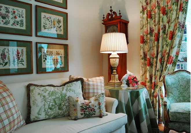
For January, we chose “toile”. Pronounced “twall”, Toile de Jouy originated in France in the late 1700s. In the French language, the phrase literally means "cloth from Jouy en Josas", a town of north-central France. Toile de Jouy, sometimes abbreviated to simply "toile", is a type of decorating pattern consisting of a usually white or off-white background on which a repeated pattern depicting a fairly complex scene, generally of a pastoral theme. Toiles also often consist of an arrangement of flowers. The pattern portion traditionally consists of a single color. Toile should be used in abundance. And while it does mix well with more rigid patterns such as stripes, checks and plaids, toile should be the predominant pattern in any room where it's displayed. See below for a beautiful example of toile fabric.
We hope that you enjoyed a wonderful holiday, and are getting off to a great start in 2010! It seems to us at this time of year the world looks a little plain. Our holiday decorations have come down and our homes look so bare. Outside, the leaves have fallen from the trees; even the view from our windows seems bare and lackluster. Wouldn’t it be nice if we had our winter design wardrobe, and just like we put our summer clothes away in exchange for our winter wardrobe, we could retrieve a fresh, new design “wardrobe” to liven up our post holiday doldrums?
We are all looking for ways to invigorate our living spaces with new life at this time of year without investing in an entire home remodel! Some tips from us to you…try freshening your look with a new fabric on accent pillows, even a small piece of upholstery. Not a huge expense, and easily changeable from season to season. Rearrange your display or book cases, adding more than just books! Lean artwork, arrange accessories and add the unexpected to the areas between the stacks and rows of books. Go a little farther, perhaps, and paint the interior back of the bookcase to match your wall color, or choose an accent color or patterned wallpaper for drama and emphasis. Rearrange accessories, even furnishings from room to room, giving them a new life and purpose and a new place in your home. Layer your rugs…laying area rugs on your broadloom carpet or on top of room size rugs gives a room feeling of warmth and coziness this time of year. Just be careful to avoid thick, bunching rugs and trip hazards. And, as always, if you need help with any of your projects we are here for you.
In our upcoming blogs we will explore trends, designer picks and favorites, and some of our “go to” reliable design choices to share with you. Each month we will select a design term, define it, give the pronunciation, and talk about its significance.
For January, we chose “toile”. Pronounced “twall”, Toile de Jouy originated in France in the late 1700s. In the French language, the phrase literally means "cloth from Jouy en Josas", a town of north-central France. Toile de Jouy, sometimes abbreviated to simply "toile", is a type of decorating pattern consisting of a usually white or off-white background on which a repeated pattern depicting a fairly complex scene, generally of a pastoral theme. Toiles also often consist of an arrangement of flowers. The pattern portion traditionally consists of a single color. Toile should be used in abundance. And while it does mix well with more rigid patterns such as stripes, checks and plaids, toile should be the predominant pattern in any room where it's displayed. See below for a beautiful example of toile fabric.
Tuesday, January 5, 2010
Welcome
Welcome to our blog. We hope to share innovative and useful tips and trends with you, and to engage in fun and informative conversations...and maybe even share some secrets! We welcome your input, comments and suggestions. Creating a beautiful home is a very personal journey, and we are excited to take that journey with you. To tell you a little bit about our design firm, the designers at Style Interiors, Inc. feel that our best work is a combination of finding what you love and using what we know to create your perfect interior. We have an in depth knowledge of products, finishes and furnishings in addition to our ability to solve design problems while at the same time helping you avoid costly mistakes. Style Interiors, Inc. is the only design firm on the peninsula to have both a LEED Accredited Professional (Leadership in Energy and Environmental Design) and Allied Members of ASID (American Society of Interior Designers) on staff. Stay tuned for informative and valuable posts...and let us know what you think!
Subscribe to:
Posts (Atom)


